Vexa Visual Identity
Vexa's identity emerges from its core promise
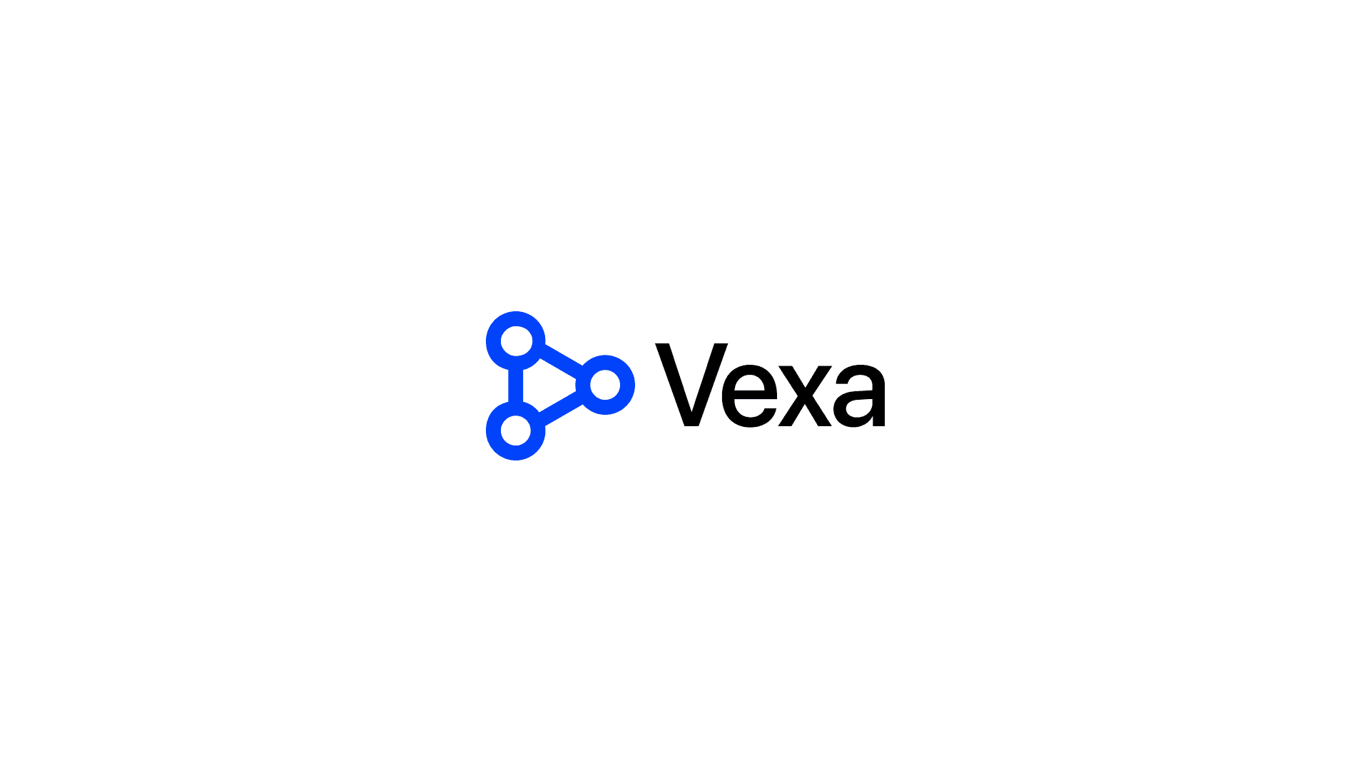
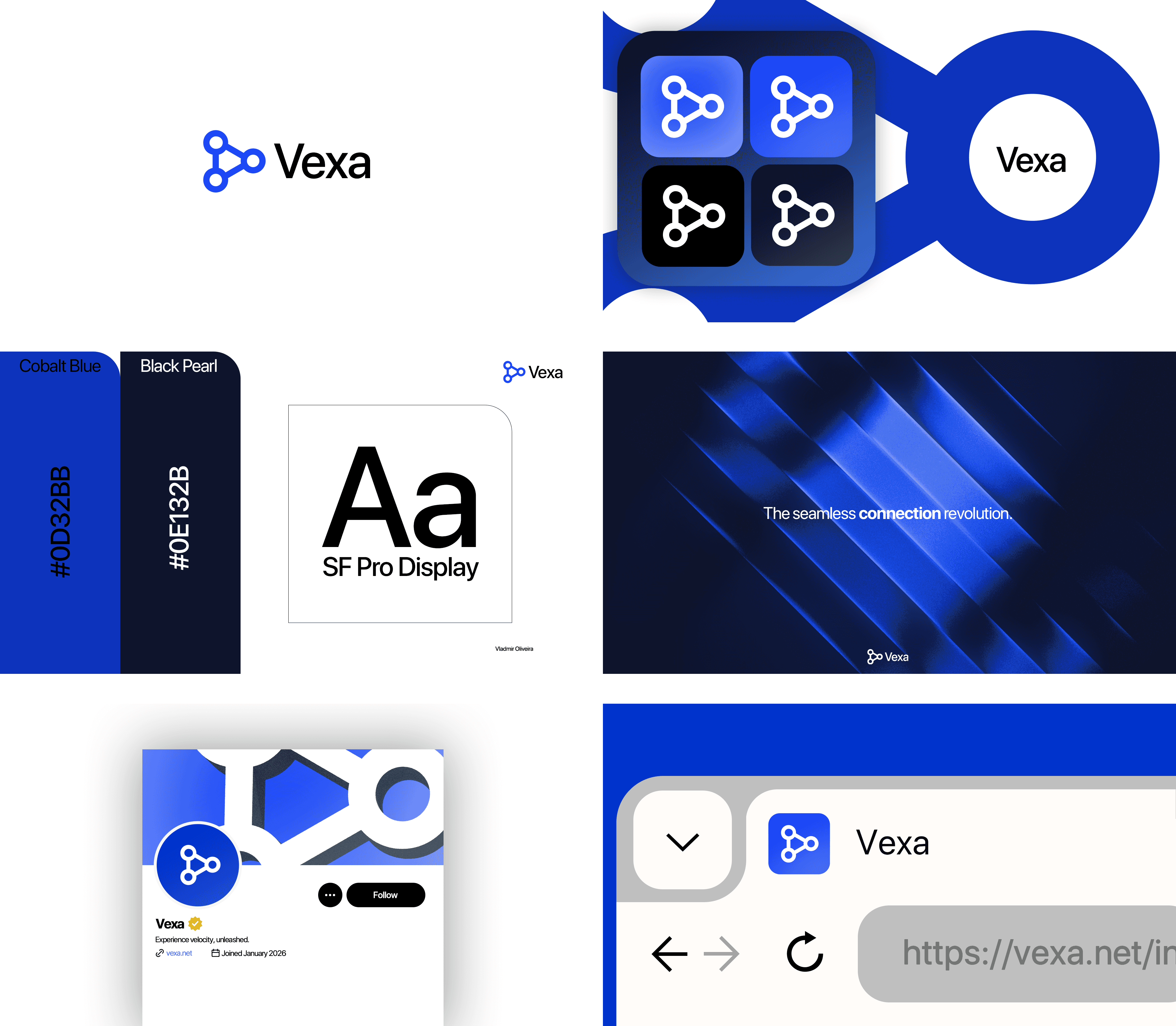
I developed the complete visual identity for Vexa, an internet connectivity brand, with a focus on performance and modernity. I created the name concept by merging velocity and nexus, and built a robust visual system from it. I strategically defined the color palette, choosing a vibrant cobalt blue as the primary color to convey trust and technology, and a deep pearl black for contrast and sophistication. I selected a Sans Serif typeface (a style I often use for visual identity projects) to ensure clarity and efficiency, aligning with the brand's proposal. I designed each element to build a cohesive visual experience, where innovation, speed, and trust are reflected in every detail of the brand.

Vexa's identity emerges from its core promise: the seamless fusion of speed and connection. From this foundational concept, a cohesive visual language was constructed to embody technological performance and unwavering reliability. A vibrant cobalt blue establishes a foundation of intelligence and trust, while a sophisticated black provides depth and bold contrast. Every element, from the precise geometry of the wordmark to the clean, highly legible sans-serif typography, is engineered for clarity and impact. The result is a dynamic system where each component reinforces a singular narrative of innovation, velocity, and dependable connection.